Combat Sports Training Platform
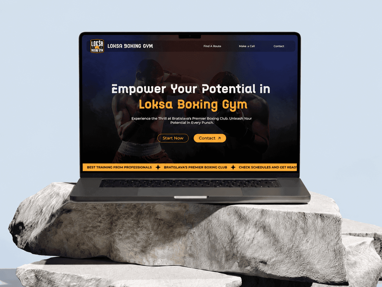
A website for a boxing and jiu-jitsu gym that shows its classes, its people, and how to join.
- Industry
- Fitness and sports training
- Timeline
- 2 months
- Services
- Website strategy, UX/UI design, Frontend development, SEO
Gunpowder Innovations worked with a boxing and martial arts training centre to build a new website. The gym has strong energy and a close community, and the old site did not show that.
The new site presents the training programmes, class times, prices, and member stories in one clear place. It works as the gym's front door for anyone thinking about joining.
The challenge
There are many gyms, and most of their websites look the same. It is hard for a visitor to see what makes one place different.
This client needed a site that could show boxing and Brazilian jiu-jitsu classes, membership options, schedules, member reviews, and the gym itself, all with a look that matches the sport.
The site also had to bring in new members, be easy to find in local search, and make the gym look professional online.
What we built
We designed and built a website that leads a visitor from first look to first message. Photos and structure do the work: what the gym offers, who teaches, what it costs, and how to get in touch.
Hero section. A bold opening that says what the gym is and invites people to join.
Training programmes. Clear sections for boxing and Brazilian jiu-jitsu classes.
Community stories. Photos and content that show gym culture, achievements, and real members.
Reviews. Honest member feedback that helps new visitors trust the place.
Class schedule. Training times laid out simply, so anyone can find a class that fits.
Membership and pricing. Plans presented side by side to make the choice easy.
Gallery. Photos of the facilities, training sessions, and events.
Contact and enquiry. Clear contact details and a form so interested people can reach the gym quickly.
Design approach
The design takes its feel from combat sports, strong and direct, but it stays welcoming. Beginners should not feel that the gym is only for experts.
Three goals shaped every page: build trust, show that the coaches know their craft, and make it easy to sign up.
We designed for phones first, since most people find a gym on their phone. Important information sits near the top. Schedules take one tap to reach. The enquiry form is short.
How it is built
The site is fast and responsive, and works on any screen size.
It includes pricing modules, a schedule section, a reviews system, a photo gallery, and contact forms that capture enquiries.
We also set up the SEO basics so the gym shows up in local searches, and connected analytics so the client can see how people use the site.
Results
A stronger brand online. The site now matches how the gym feels in person.
More enquiries. Clear calls to action and simple forms turn visitors into leads.
Better engagement. People can explore programmes, schedules, prices, and stories without hunting for them.
Easier to find information. Simple navigation gets visitors to what they need.
More trust. Reviews, photos, and coach profiles give new members confidence.
Ready for more. The site can grow with new services and marketing campaigns.
Conclusion
This project shows how good design and a clear plan can lift a fitness brand well beyond a basic website.
By combining strong visuals, community stories, clear programme information, and simple paths to sign up, Gunpowder Innovations helped the gym grow its membership and build its reputation online.
Building something similar?
Let's talk about your fitness and sports training project.
Website strategy, UX/UI design, Frontend development, SEO — the same team that delivered this can take yours from first sketch to launch.
More projects.

Interested in a quoted project?
Tell us a little about what you're working on. We take on a limited number of projects at a time, and we'll tell you honestly if we're the right fit.